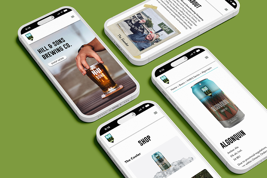
For this project I was tasked with creating a brand identity, labels for a three can series, and a website for a fictional craft brewery.
Hill and Sons Brewing Co. is founded on the three pillars of Good Beer, Good Company, and The Great Outdoors.
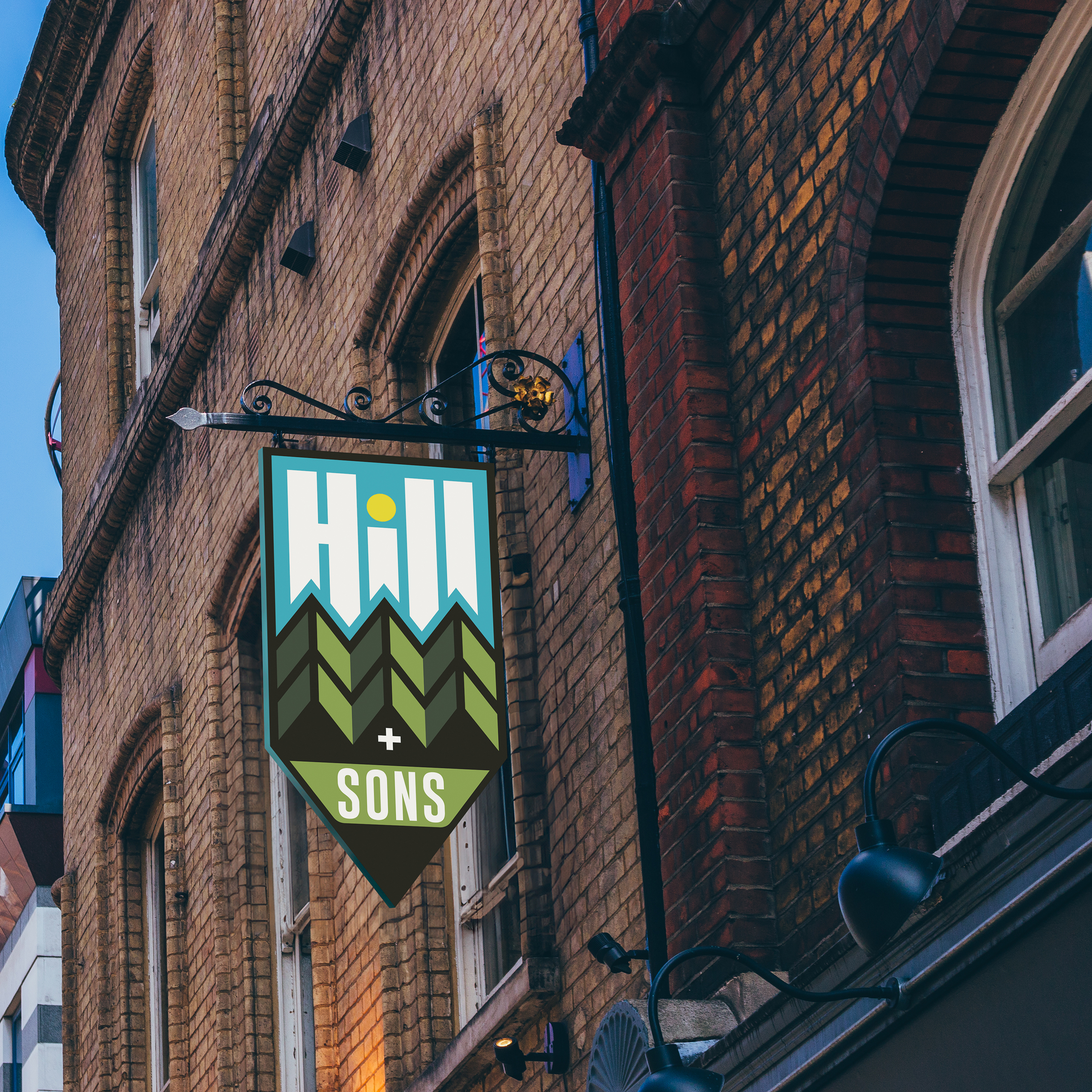
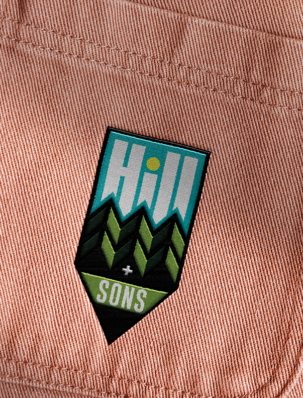
The company’s primary logo is inspired by the original Ontario Parks logo, which was crest-shaped and featured three trees. In the Hill and Sons logo, the crest is reminiscent of a wayfinding icon, resonating with their target audience of fellow nature enthusiasts. Geometric trees are used here to represent the three Hill sons and create a motif that can be used across the brand.
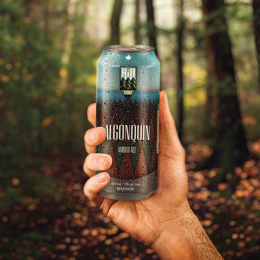
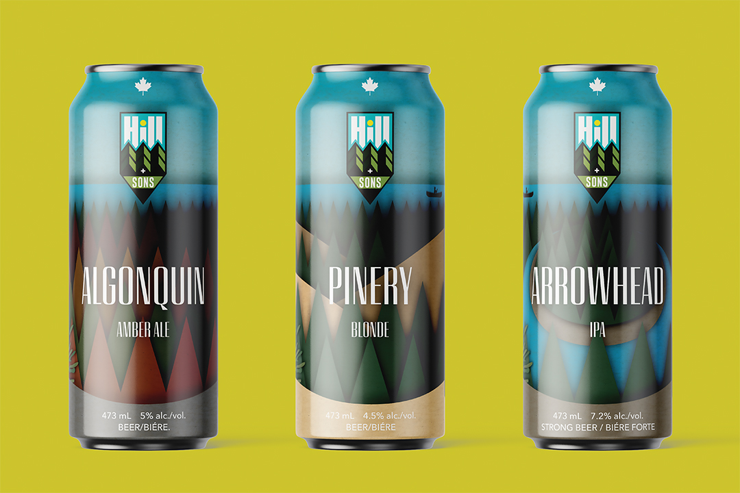
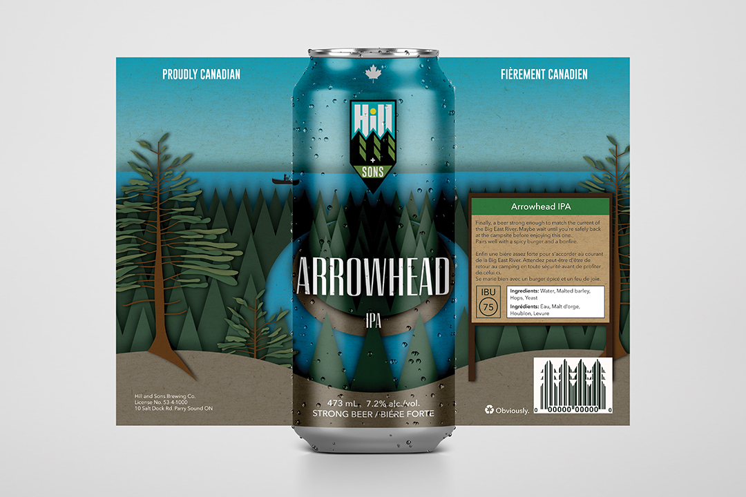
Hill and Sons’ PARKS series shines a spotlight on the incredible landscapes our provincial parks have to offer. The cut-paper design amplifies the playful nature of the brand, and its three-dimensional appearance makes it impossible to miss on the shelf. Each can depicts a different provincial park, but retains elements for consistency across the product line. This line creates an opportunity for accelerated growth through collaborations with Ontario Parks.
